



























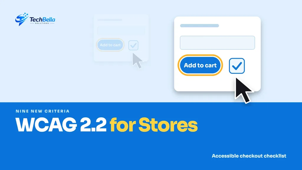
An online store that some customers cannot use is a store that loses sales, whether or not anyone complains. Accessibility, making sure people with disabilities, older customers and people using assistive technology can browse and buy, is both good practice and good business. The standard most teams follow is WCAG, the Web Content Accessibility Guidelines.
This WCAG 2.2 guide explains what the current version adds and what it means for an online store: sticky headers that hide focused buttons, tiny tap targets, drag-only filters, repeated form entry and login puzzles. It uses the W3C’s own summary of what is new, and it translates each requirement into checks for WordPress, WooCommerce and Shopify stores. It is not legal advice, so check which rules apply to you.
| WCAG 2.2 area | Store example |
|---|---|
| Focus Not Obscured (AA) | A sticky header covering the focused Add to cart button |
| Target Size Minimum (AA) | Tiny quantity steppers and swatches |
| Dragging Movements (AA) | A price slider with no text box alternative |
| Accessible Authentication (AA) | Login that relies on a puzzle CAPTCHA only |
What WCAG 2.2 is
According to the W3C’s What’s New in WCAG 2.2, WCAG 2.2 became a W3C Recommendation on 5 October 2023. The success criteria from 2.0 and 2.1 are essentially the same in 2.2, with one exception: 4.1.1 Parsing is obsolete and was removed. In practice, a site that meets 2.1 is most of the way to 2.2.
The new criteria are graded by level: A is the baseline, AA is the level most organisations aim for and AAA is the highest.
The nine new criteria
The W3C lists these additions:
| Criterion | Level | What it means |
|---|---|---|
| 2.4.11 Focus Not Obscured (Minimum) | AA | A focused element must not be fully covered by content you add, such as banners |
| 2.4.12 Focus Not Obscured (Enhanced) | AAA | A focused element must not be covered at all |
| 2.4.13 Focus Appearance | AAA | Focus indicators must be large enough and contrast well |
| 2.5.7 Dragging Movements | AA | Anything done by dragging must also work with a single click or tap |
| 2.5.8 Target Size (Minimum) | AA | Targets must be at least 24 by 24 CSS pixels, or have enough spacing |
| 3.2.6 Consistent Help | A | Help options repeated across pages appear in the same place |
| 3.3.7 Redundant Entry | A | Do not make users re-enter information they already gave in the same process |
| 3.3.8 Accessible Authentication (Minimum) | AA | Login must not depend on memory or puzzles without an alternative |
| 3.3.9 Accessible Authentication (Enhanced) | AAA | The same, with no exceptions |
Who benefits from an accessible store
Accessibility is often described as a matter for a small group of users, but the benefits are broader. A customer with a broken wrist who uses only a keyboard, someone shopping on a phone in bright sunlight, an older person who finds small text hard to read, a user with a temporary injury and a person using a screen reader all rely on the same foundations: clear structure, visible focus, big enough targets and forms that behave predictably.
Fixing these problems tends to improve the experience for every visitor. A form that does not ask for the same data twice is faster for everyone. A button that is easy to tap reduces errors. That is why accessible stores often convert better, though we make no promise about numbers.
What each one means for a store
Focus not obscured
Keyboard users move through links and buttons with the Tab key. A sticky header, cookie banner or chat widget can sit on top of the focused element so it disappears from view. Test by tabbing through a product page and the checkout and check that the focused item is always at least partly visible.
Dragging movements
Price sliders, image carousels and sortable lists often need dragging. Offer an alternative, such as input boxes for minimum and maximum price, or next and previous buttons.
Target size
Small close buttons, quantity steppers, colour swatches and footer links are common offenders. Aim for at least 24 by 24 pixels, and more on touch screens.
Consistent help
If you show a phone number, chat link or contact page on one page, put it in the same relative place on the others, including the checkout.
Redundant entry
Checkout forms that ask for the same address twice, once for billing and again for shipping, are annoying for everyone. Offer “same as billing” and keep entered data within the flow.
Accessible authentication
Logins and account creation should not depend on remembering a password through a puzzle or solving a hard visual challenge without an alternative. Allow password managers and pasting, and offer alternatives to image-based CAPTCHAs.
Common accessibility problems on store templates
When we review store templates, the same issues come up again and again:
- Low contrast text, especially light grey on white for prices, labels and placeholders.
- Images without useful alternative text, such as product photos with file names as descriptions.
- Icon-only buttons for cart, search or menu with no accessible name.
- Colour as the only signal, for instance red text alone to show an error or a sold-out variant.
- Popups that trap focus or cannot be closed with the keyboard.
- Form fields without visible labels, relying only on placeholder text that vanishes as you type.
These are not exotic failures, and most are quick to fix in a theme once someone has pointed them out. They are also worth testing every time a template changes.
A practical audit in four steps
Step 1: Test with a keyboard
Unplug your mouse and try to complete a purchase. Can you reach every control, see where you are and finish the order?
Step 2: Check on a phone
Tap every button on product, cart and checkout pages. If you miss often, targets are too small or too close.
Step 3: Run an automated scan
Tools such as browser extensions and Lighthouse find many issues, but automated tests catch only part of the problems, so they supplement manual checks and do not replace them.
Step 4: Fix by template
Fix the header, product, cart and checkout templates first. One fix there improves every page that shares it.
Where this intersects with performance and security
Accessible pages also tend to be well structured, which helps search engines. Interactions that respond quickly matter too, as we explain in our guide to Interaction to Next Paint. If you use block checkout, check which fields and widgets your payment plugin adds, as covered in our checkout block guide.
How to make accessibility part of your normal work
A one-off audit is a good start, but accessibility slips back unless it is part of routine work. Add three habits. First, include a keyboard test and a phone tap test in your checklist for every release. Second, ask any developer or agency to confirm that new components meet the relevant WCAG 2.2 criteria before they go live. Third, review your top templates after each major theme or plugin update.
Keep a short accessibility statement on your site describing your goal and a way to report problems. Reply to reports promptly and record what you fixed. This shows good faith, and the reports often point to issues no scan will find.
A short accessibility checklist
- Focus is visible and never fully hidden by sticky elements.
- Anything dragged also works with a click or tap.
- Buttons and links meet the minimum target size.
- Help and contact options appear consistently.
- Forms do not ask for the same data twice.
- Login does not depend on puzzles without an alternative.
Our WordPress and ecommerce development teams can audit and fix your templates.
Testing with real assistive technology
Automated tools and keyboard tests are a good start, but nothing replaces a short session with a screen reader or voice control. Free screen readers exist for most computers and phones, and a half-hour session on a product page and checkout often shows problems no scan reports: a button announced only as “button”, a price read out in the wrong order, a modal that never announces itself.
If you can, ask a person who uses assistive technology every day to try your store and listen to what they find. Pay them fairly for their time. Their feedback is worth more than any score, and it guides your fixes toward the issues that actually block purchases.
Accessibility and legal risk: keep expectations realistic
Some businesses worry about legal exposure, and rules do vary by country. We are not lawyers and cannot say what applies to you, so ask for advice if this matters. What we can say is that a visible effort helps in practice: a clear accessibility statement, a way to report problems, quick fixes and a record of testing.
Treat WCAG 2.2 AA as a sensible target, work through the highest-traffic templates first and keep improving. Perfection is not realistic for a changing store, but steady, documented progress is.
Quick wins you can ship this week
If you want results fast, start with five small changes. Raise the contrast of light grey text. Add visible labels to every form field. Give icon-only buttons an accessible name. Increase the size and spacing of small tap targets such as quantity buttons and close icons. Make sure the sticky header and cookie banner never cover the focused element. Each of these can be done in a theme in hours, and together they improve the experience for every customer, not only those using assistive technology.
Want an accessibility review of your store?
We can test your header, product, cart and checkout templates against WCAG 2.2 and fix what we find.
Frequently Asked Questions
What is new in WCAG 2.2?
According to the W3C, WCAG 2.2 adds nine success criteria covering focus visibility, dragging, target size, consistent help, redundant entry and accessible authentication, and removes 4.1.1 Parsing as obsolete.
When did WCAG 2.2 become a standard?
It became a W3C Recommendation on 5 October 2023.
Is my WooCommerce store required to meet WCAG 2.2?
Legal requirements depend on your country, your customers and your sector, so ask a lawyer. Meeting WCAG 2.2 AA is a widely used target and improves usability for everyone.