




























Eleven ready-made layouts show what the gallery can do. Each one is a normal product with its own images. To use a layout across your whole store, enter the same values under TechBella Gallery and then Gallery Settings. Pro options are marked in the other articles of this category.
Layout 1: Video thumbnails
A bottom thumbnail strip with video thumbnails. Clicking a video image opens the video in the lightbox.
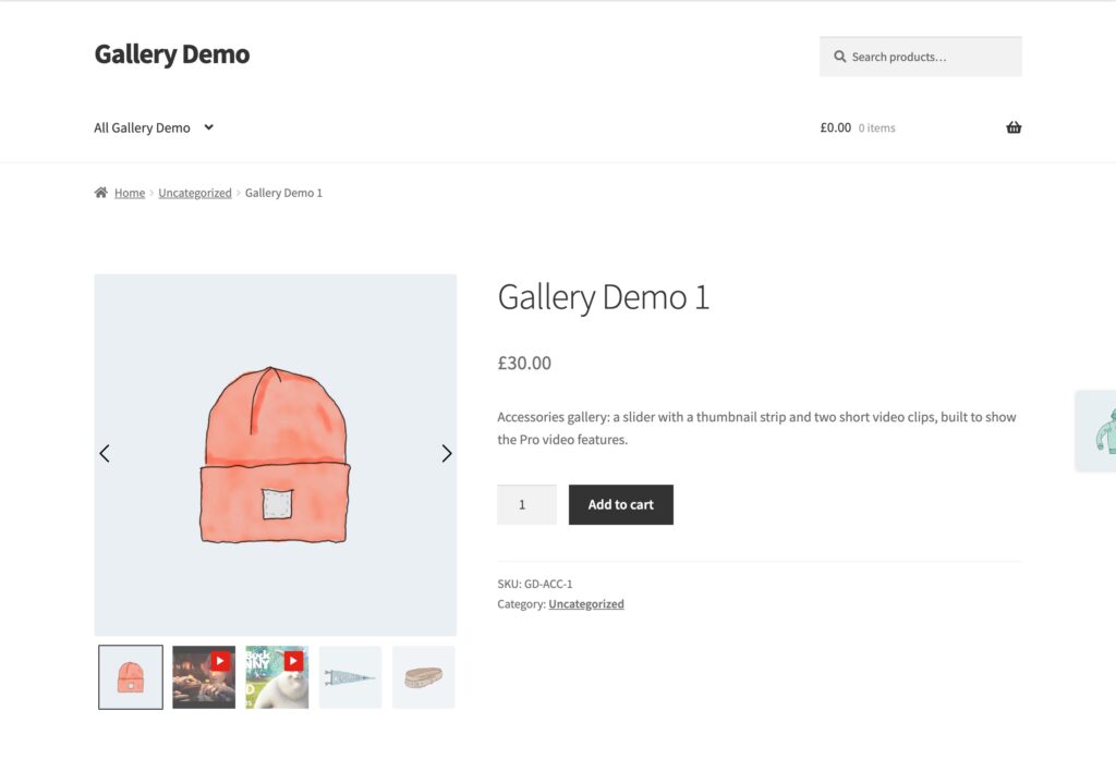
Settings used
- Thumbnail Position: Bottom
- Visible Thumbnails: 5
- Thumbnail Arrows: off
- Video Display: Lightbox Mode
- Play Button on Main Image: off
- Transition Effect: Slide
Layout 2: Side thumbnails
A fade transition with a vertical thumbnail strip on the left and an icon that opens the lightbox.
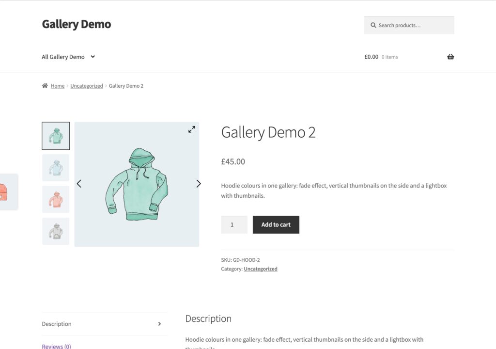
Settings used
- Transition Effect: Fade
- Thumbnail Position: Left
- Lightbox Icon: Expand
- Show Lightbox Thumbnails on Open: on
- Lightbox Thumbnail Position: Horizontal
Layout 3: Dot navigation
A clean slider with dots and no thumbnail strip.

Settings used
- Hide Thumbnails: on
- Dot Indicators: on
- Animated Arrows: on
- Lightbox Icon: Expand
Layout 4: Thumbnail strip with video
Five bottom thumbnails and a video image that opens in the lightbox.
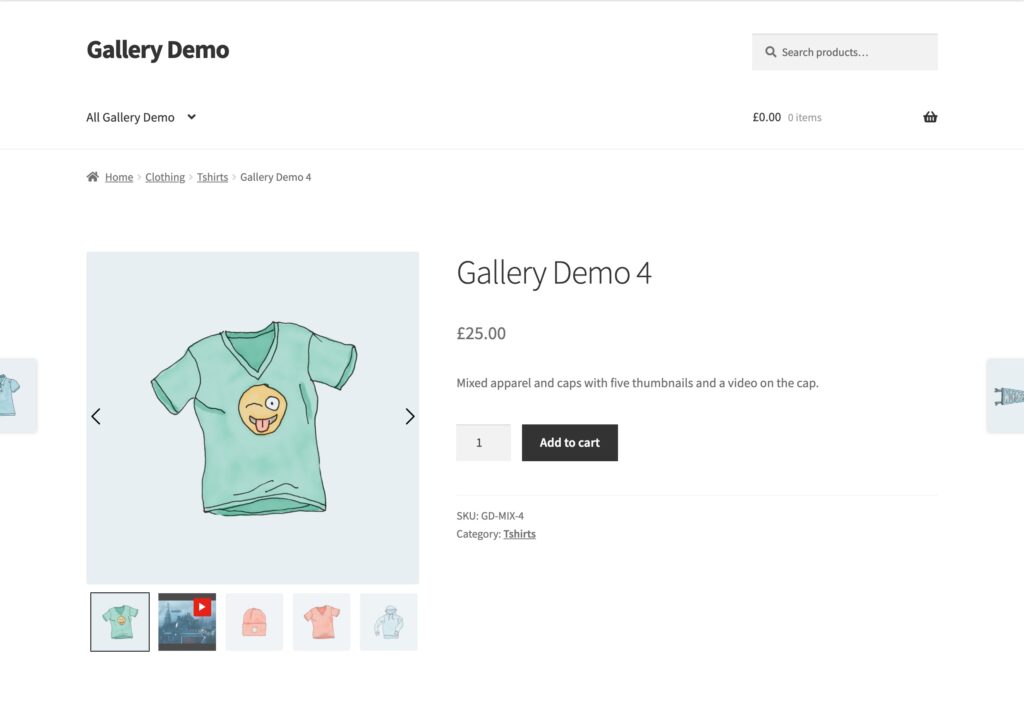
Settings used
- Thumbnail Position: Bottom
- Visible Thumbnails: 5
- Video Display: Lightbox Mode
- Play Button on Main Image: off
Layout 5: Variation images
A variable product. Choosing a colour and a logo option switches the gallery to that variation’s own images.
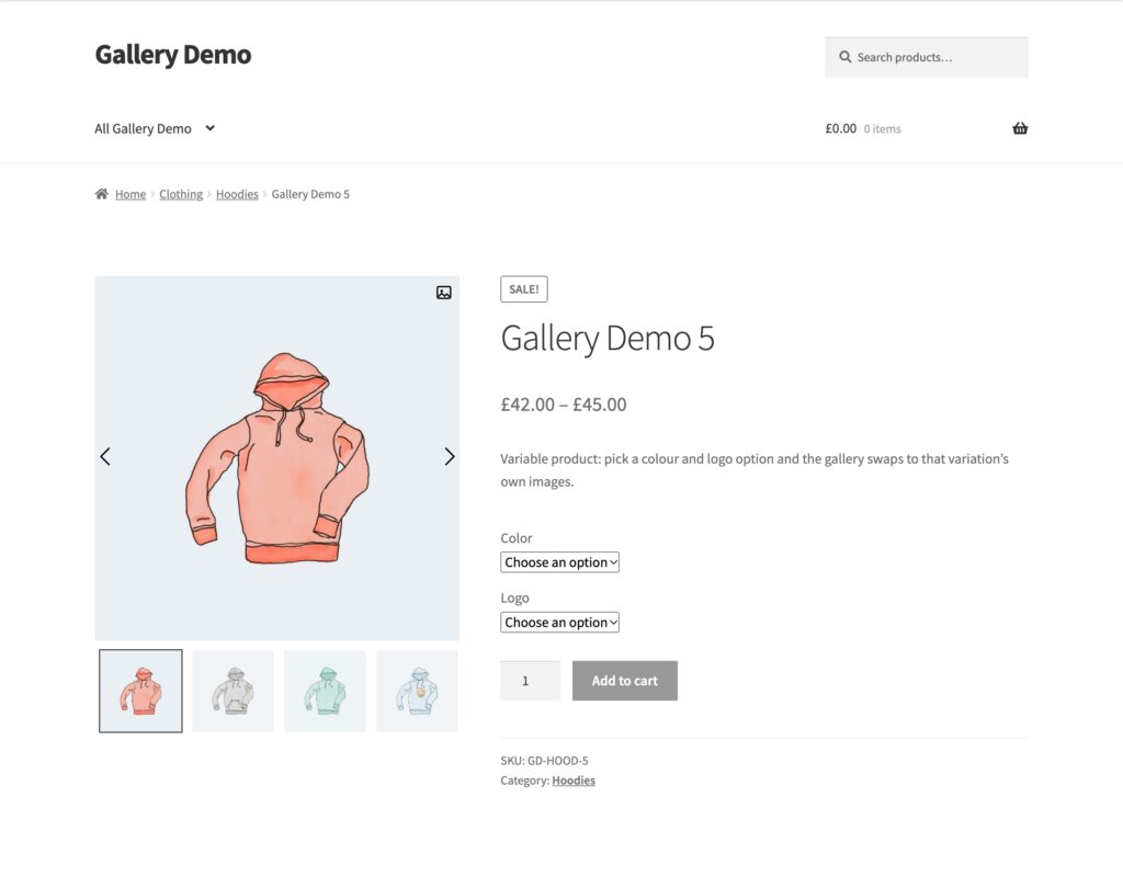
Settings used
- Variation Behavior: Classic
- Lightbox Icon: Picture
- Thumbnail Position: Bottom
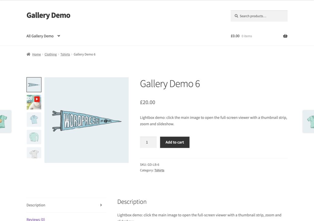
Layout 6: Lightbox with thumbnails
Eight images with a side strip. Click the main image to open the lightbox with its own thumbnail strip.
Settings used
- Thumbnail Position: Left
- Visible Thumbnails: 5
- Lightbox Icon: No icon (click the image)
- Show Lightbox Thumbnails on Open: on
- Animated Arrows: on
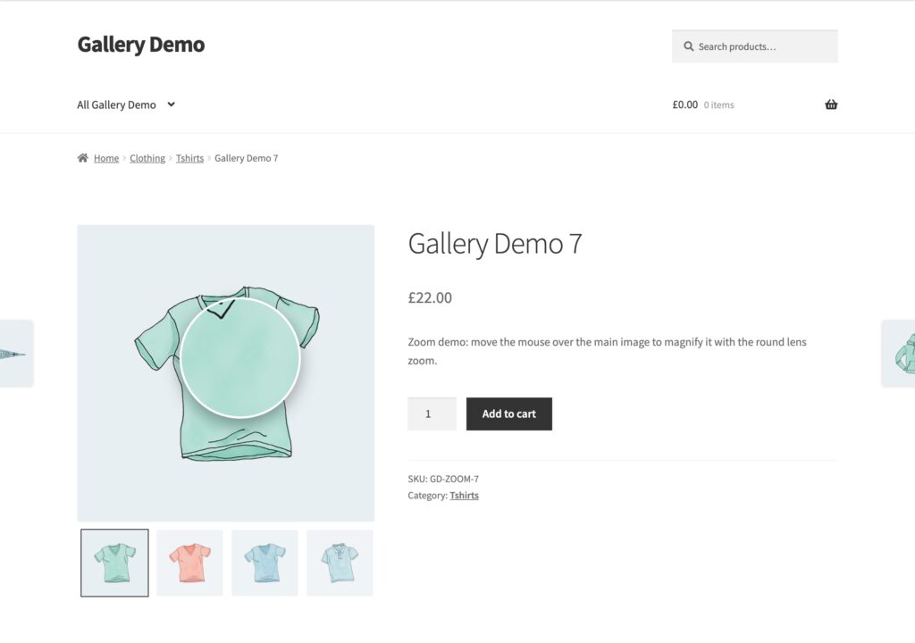
Layout 7: Lens zoom
Move the mouse over the main image to magnify it with a round lens, using the full-size picture.
Settings used
- Hover Zoom: on
- Zoom Mode: Lens (Magnifier)
- Zoom Image Size: Full
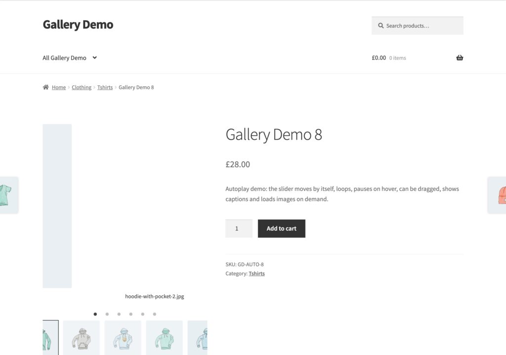
Layout 8: Autoplay with captions
A slider that moves on its own, loops, pauses on hover, can be dragged, shows captions and loads images on demand.
Settings used
- Autoplay: on, Autoplay Delay 3000 ms
- Pause on Hover: on
- Loop Images: on
- Drag to Slide: on
- Show Image Captions: on
- Lazy Load Images: On Demand
- Dot Indicators: on
Layout 9: Video inside the gallery
Videos play in place, in the same frame as the pictures, with the thumbnails on the right.

Settings used
- Video Display: Inner Gallery Section
- Video Height: 416 px
- Play Button on Main Image: on
- Thumbnail Position: Right
Layout 10: Custom styling
Bold orange arrows, rounded picture corners, a corner icon for the lightbox and coloured thumbnail borders.

Settings used
- Arrow Style: Bold arrow, Arrow Color #ffffff, Arrow Background #e2401c
- Lightbox Icon: Corners, with its own colours
- Lightbox Background: rgba(20,20,60,0.92) and Lightbox Text Color: #ffd166
- Lightbox Slide Effect: Circular
- Inactive / Active Thumbnail Border: #dddddd / #e2401c
- Tablet and Mobile visible thumbnails: 3
- Custom CSS: .techbella-for .slick-slide img { border-radius: 14px; }
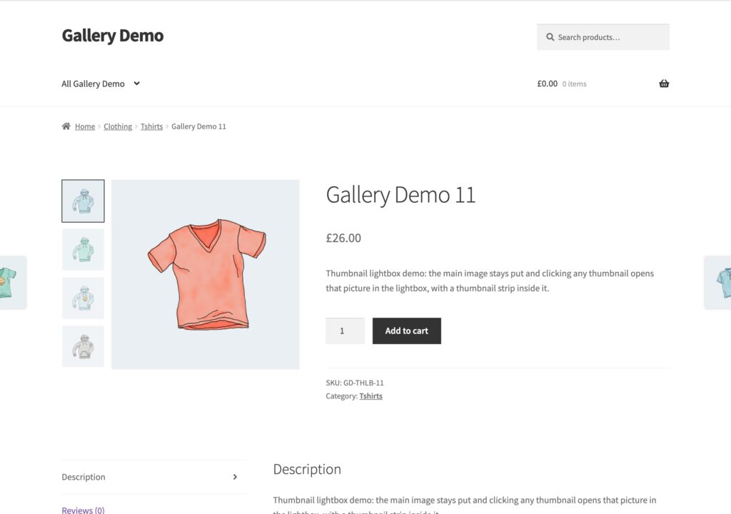
Layout 11: Thumbnail opens the lightbox
The main image stays still and a click on any thumbnail opens that picture in the lightbox.
Settings used
- Thumbnail Click Opens Lightbox: on
- Thumbnail Position: Left
- Show Lightbox Thumbnails on Open: on
Tablets and phones
On screens up to 1024 px wide, side thumbnails move under the image so the picture keeps its full width. Visible thumbnails for tablets and phones are set on the Tablet and Mobile tabs of Thumbnail Strip.